/ type
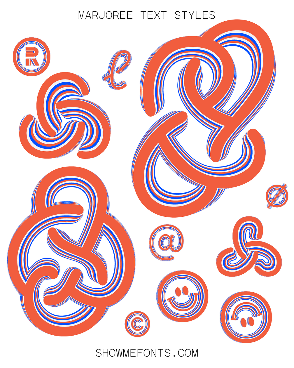
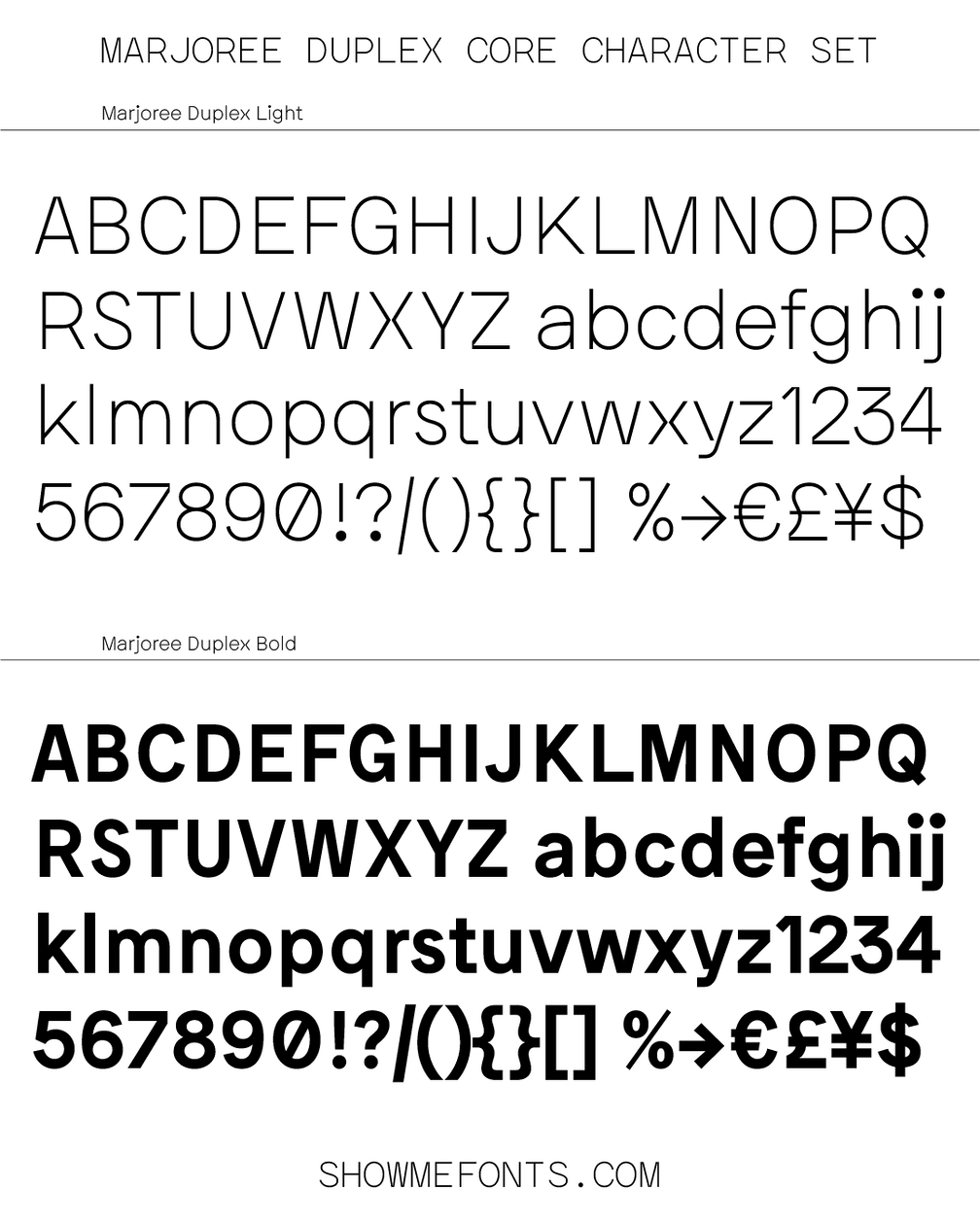
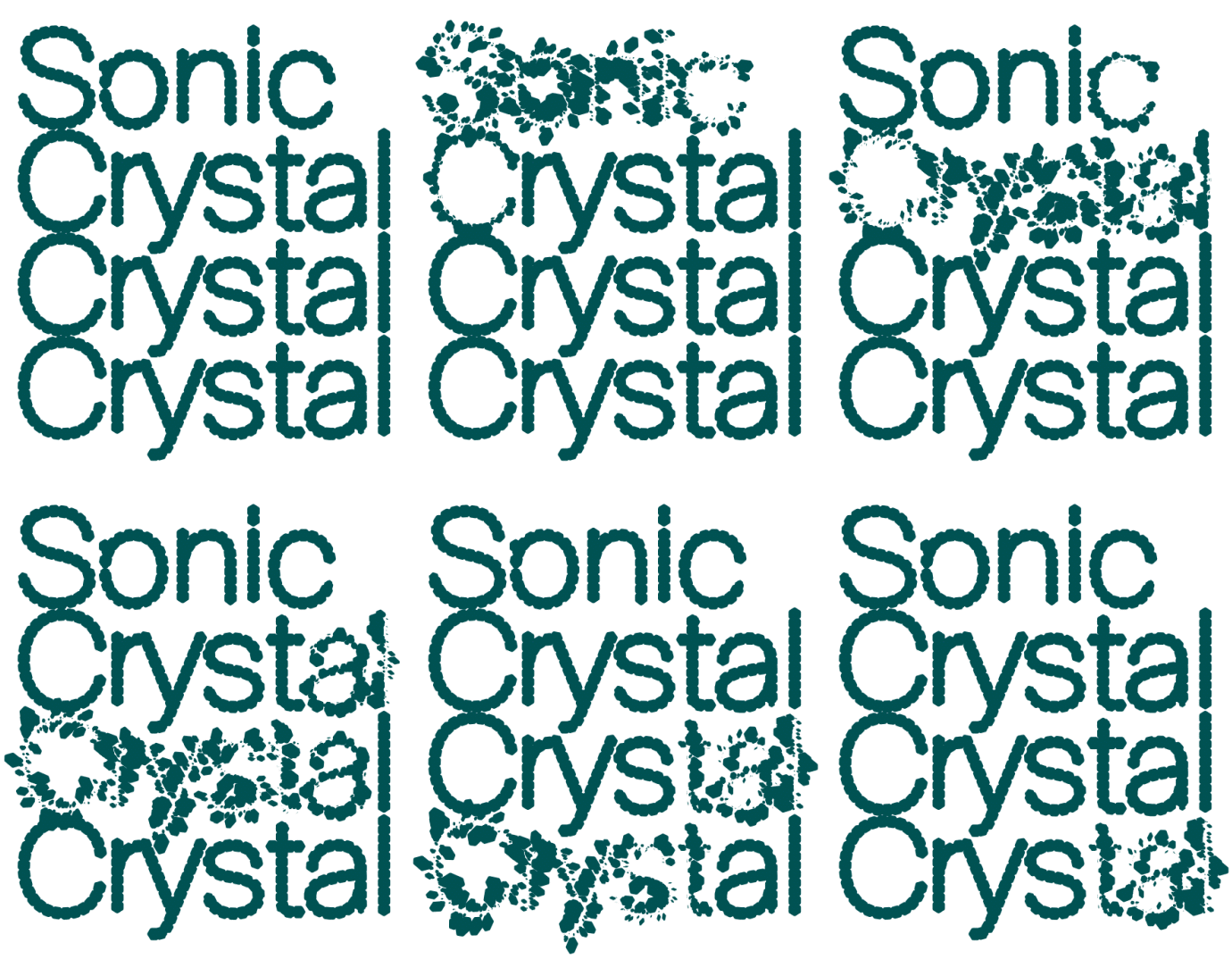
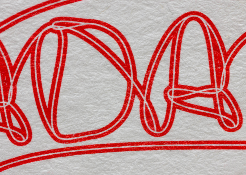
October 2024 – Marjoree is a highly versatile sans serif type family that is designed with Mono and a Duplex styles. Marjoree can switch between weights without any reflow of the text. This duplex feature makes Marjoree a practical typesetting tool in both book design and in web design, and wherever variable font features expand creative opportunities. Available at showmefonts.
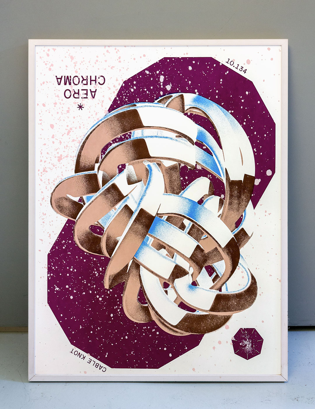
Aero Chroma
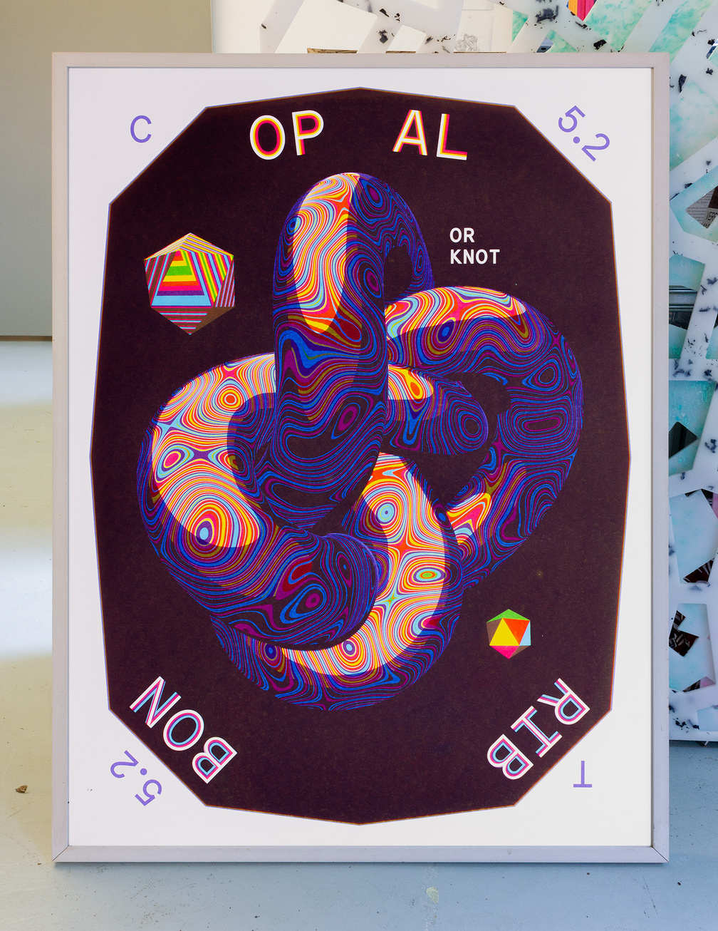
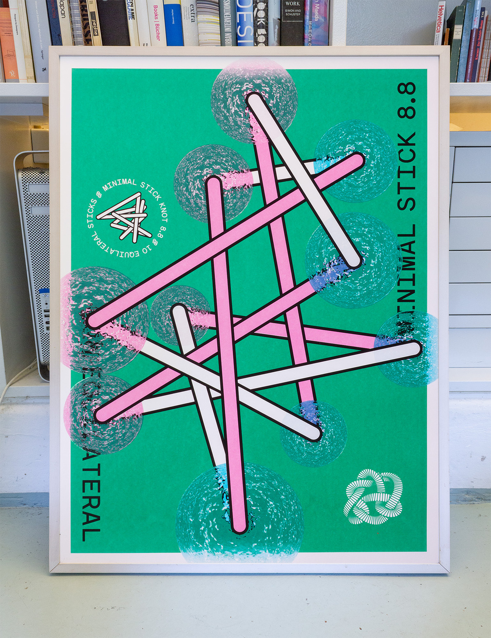
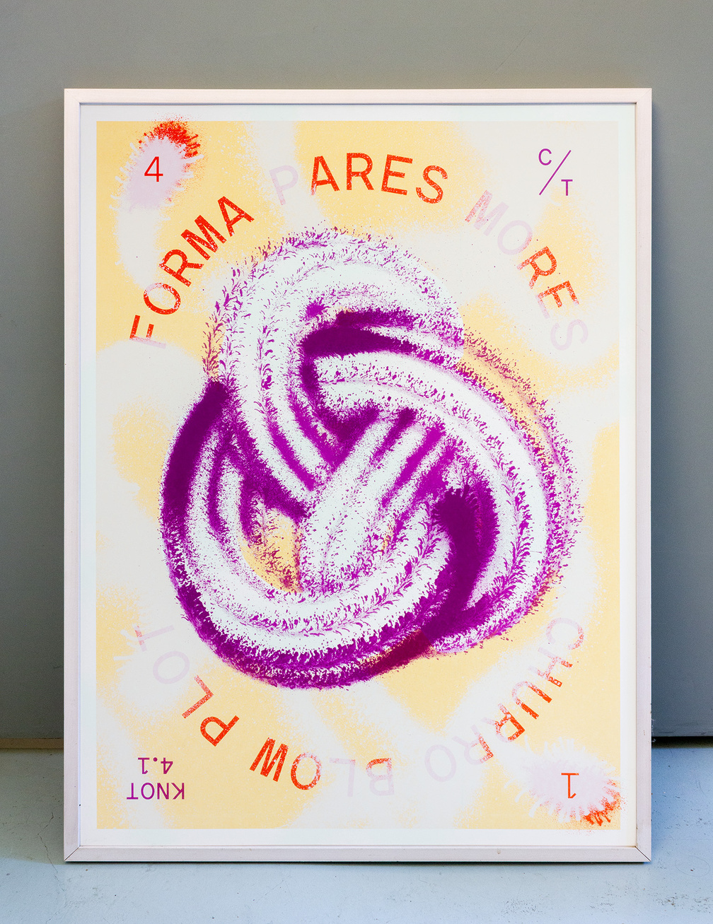
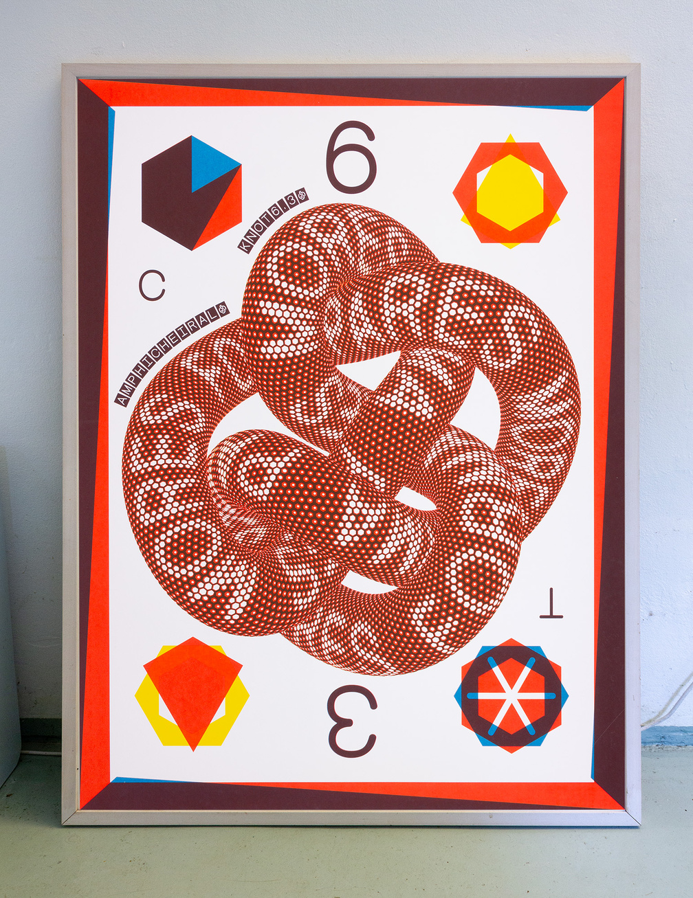
September 2024 – Limited edition Screen prints of Mathematical Knots
Half Rhyme
August 2024 – Visual identity for "Half Rhyme", an exhibition and lecture series at Plaatsmaken, Arnhem.
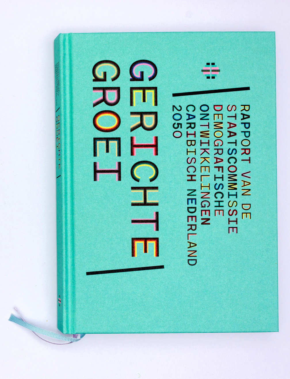
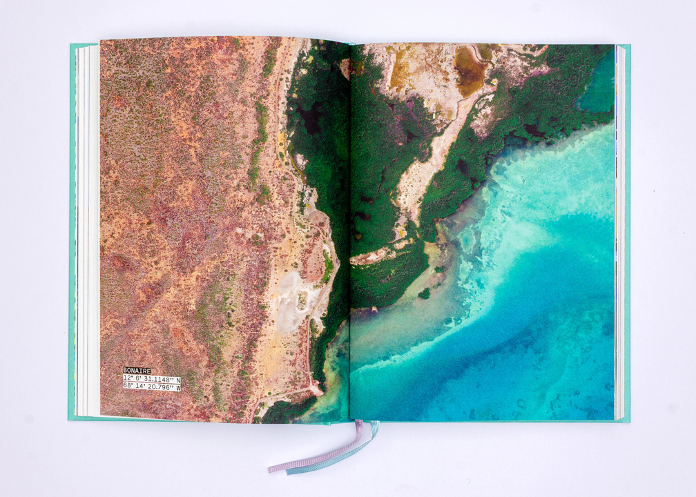
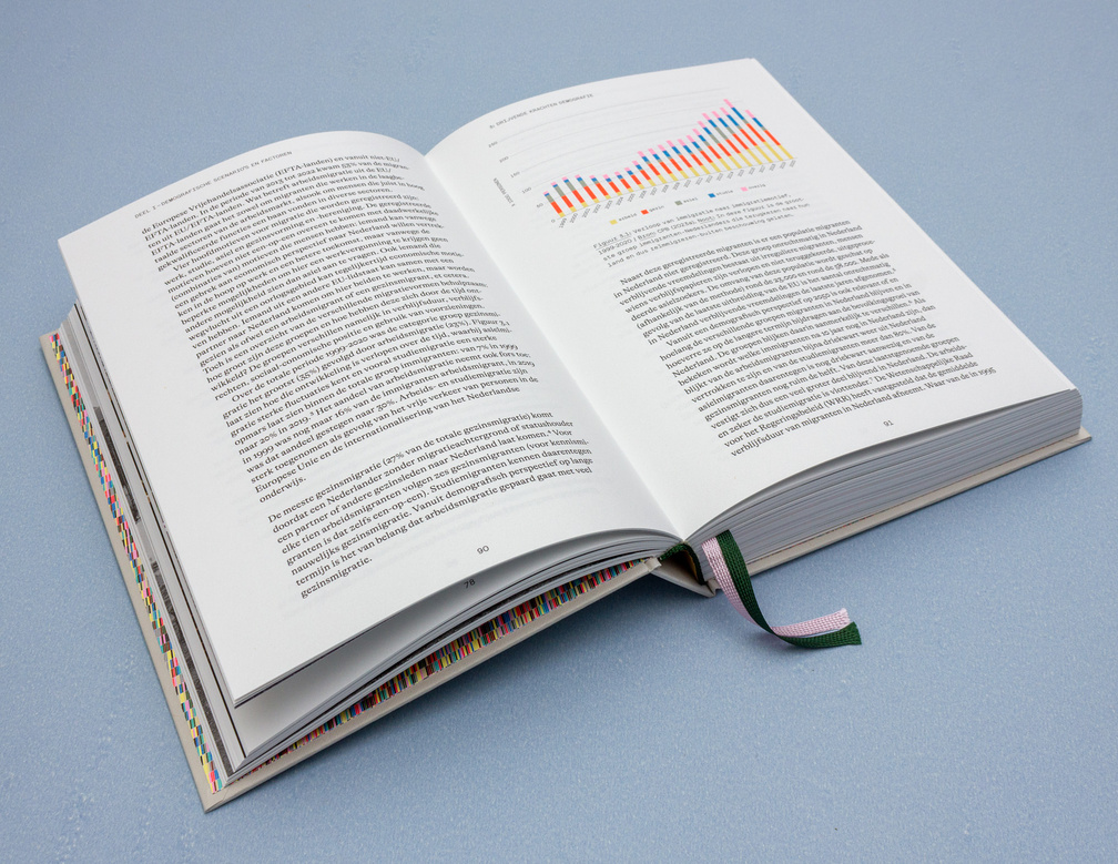
July 2024 – Design for final report of the Dutch State Commission for Demographic Developments 2050 (Caribbean Netherlands)
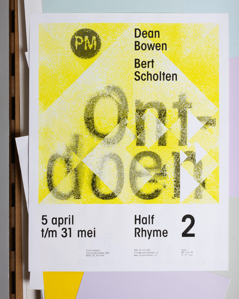
Half Rhyme
April 2024 – Visual identity for "Half Rhyme", an exhibition and lecture series at Plaatsmaken, Arnhem.
PM logo
February 2024 – Logo for Plaatsmaken, Arnhem
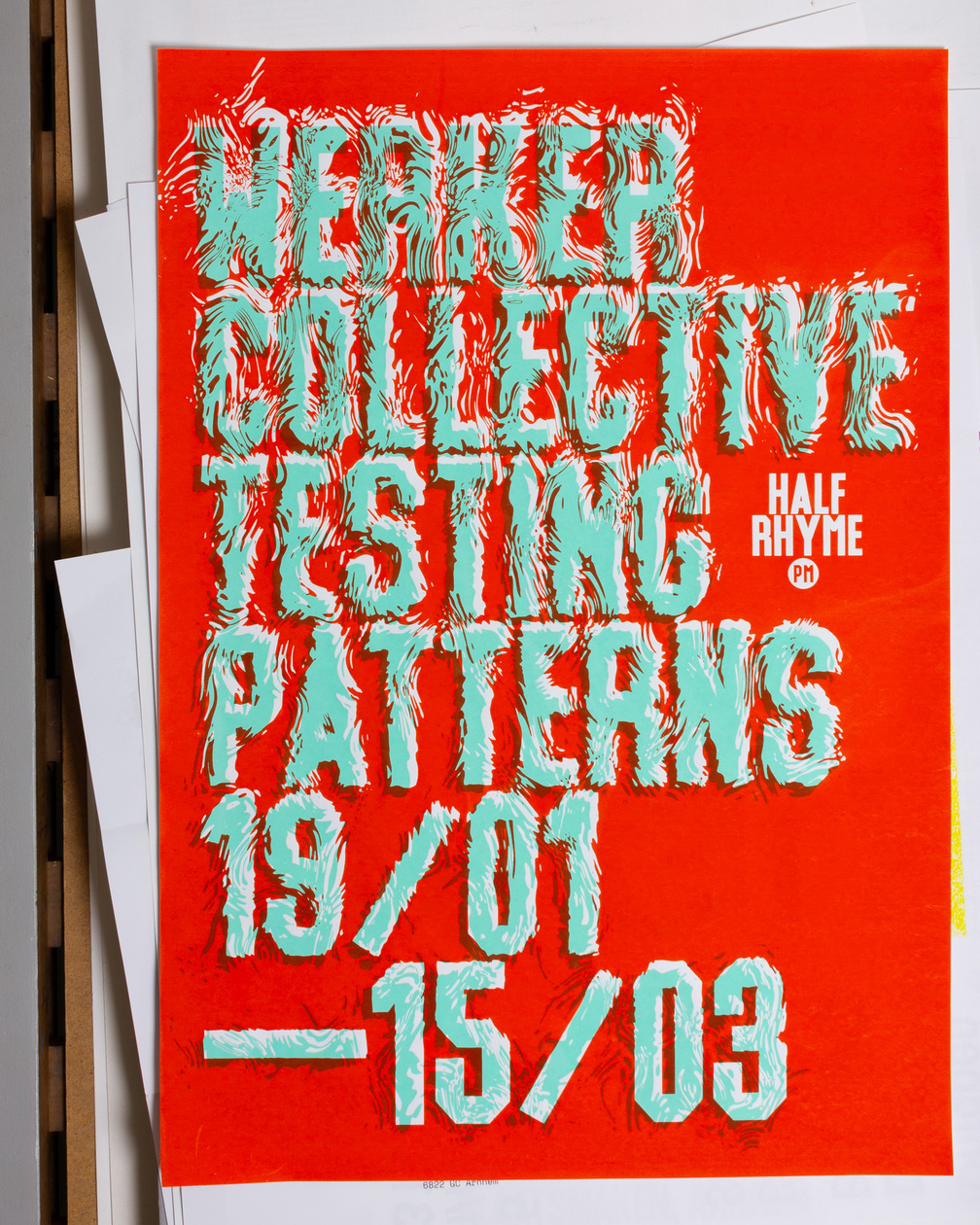
Half Rhyme
January 2024 – Visual identity for "Half Rhyme", an exhibition and lecture series at Plaatsmaken, Arnhem.
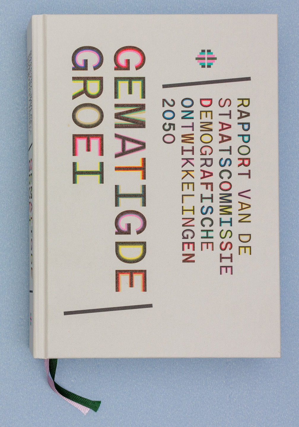
January 2024 – Design for final report of the Dutch State Commission for Demographic Developments 2050
Marjoree
January 2024 – Marjoree Mono & Proportional, a variable duplex font. Coming soon.
Marjoree Hex
October 2023 – Marjoree Hexagon, a variable duplex font. Coming soon.
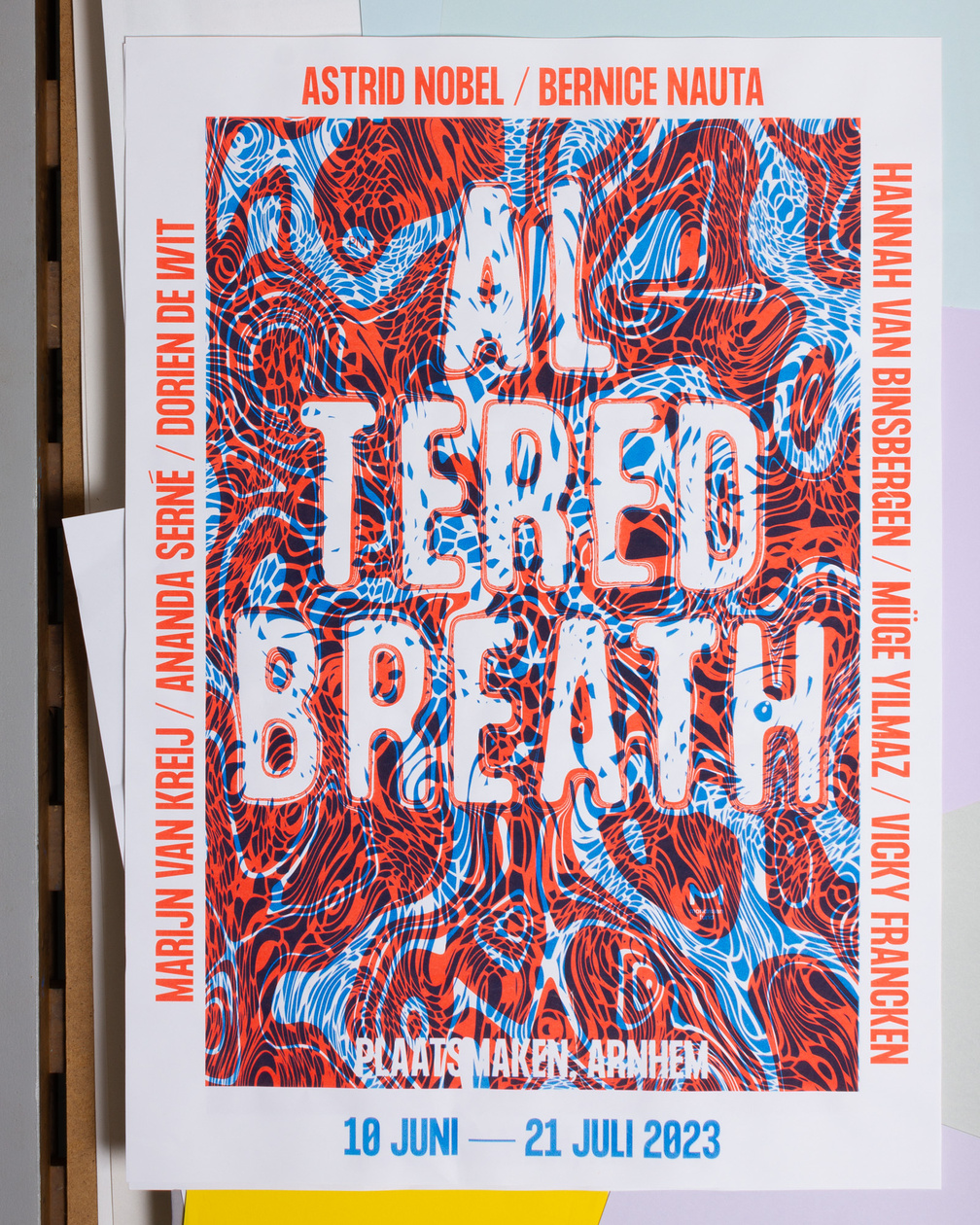
Altered Breath
June 2023 – Visual identity for "Altered Breath", an exhibition and lecture series at Plaatsmaken, Arnhem.
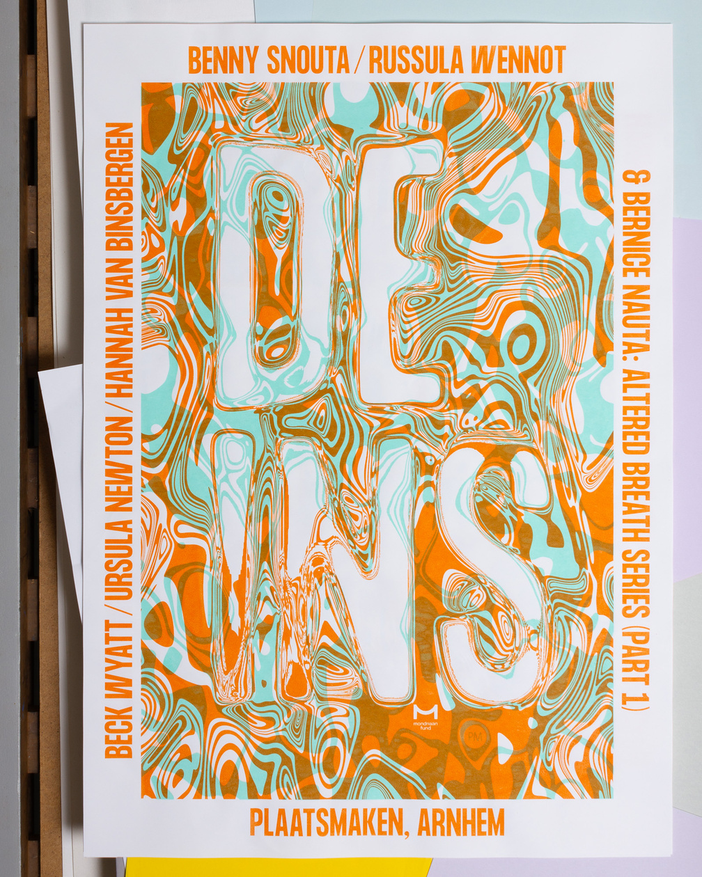
Half Rhyme
June 2023 – Visual identity for "Altered Breath", an exhibition and lecture series at Plaatsmaken, Arnhem.
Variable
May 2023 – Test for Variable Font Marjoree
Knot 6.3 shader
April 2023 – Shader test for knot 6.3 poster
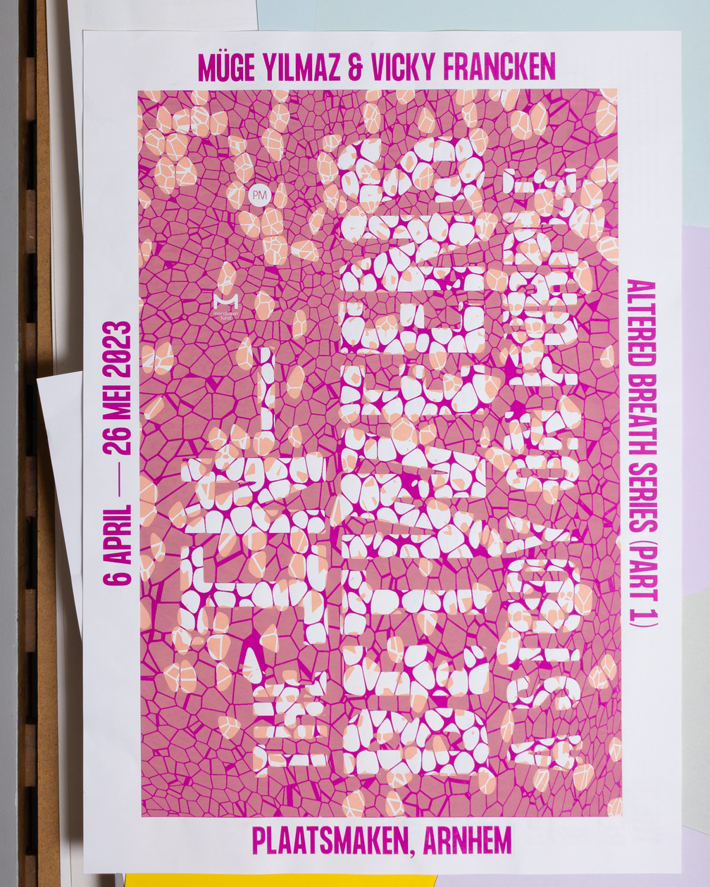
Half Rhyme
April 2023 – Visual identity for "Altered Breath", an exhibition and lecture series at Plaatsmaken, Arnhem.
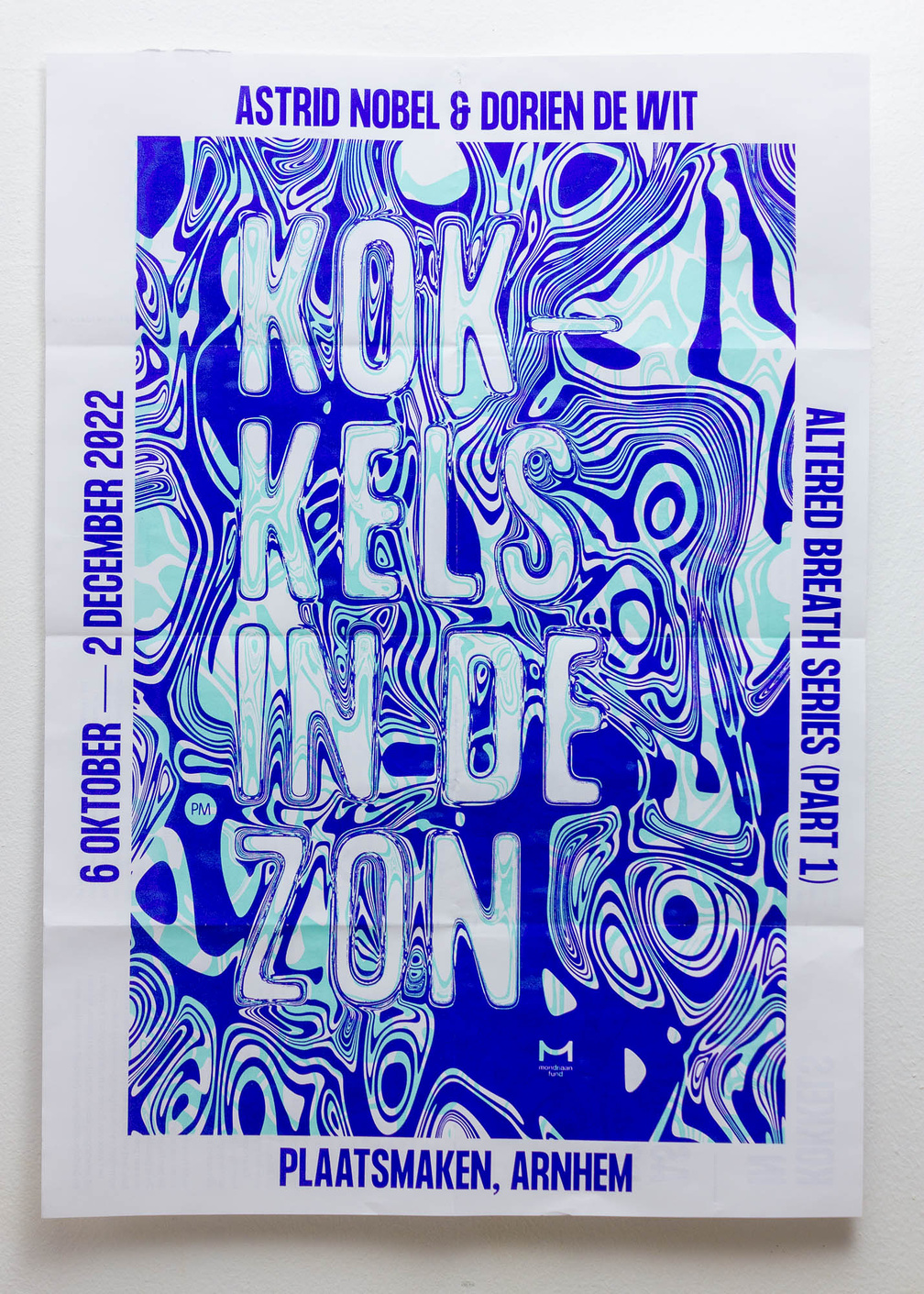
Altered Breath
October 2022 – Visual identity for "Altered Breath", an exhibition and lecture series at Plaatsmaken, Arnhem.
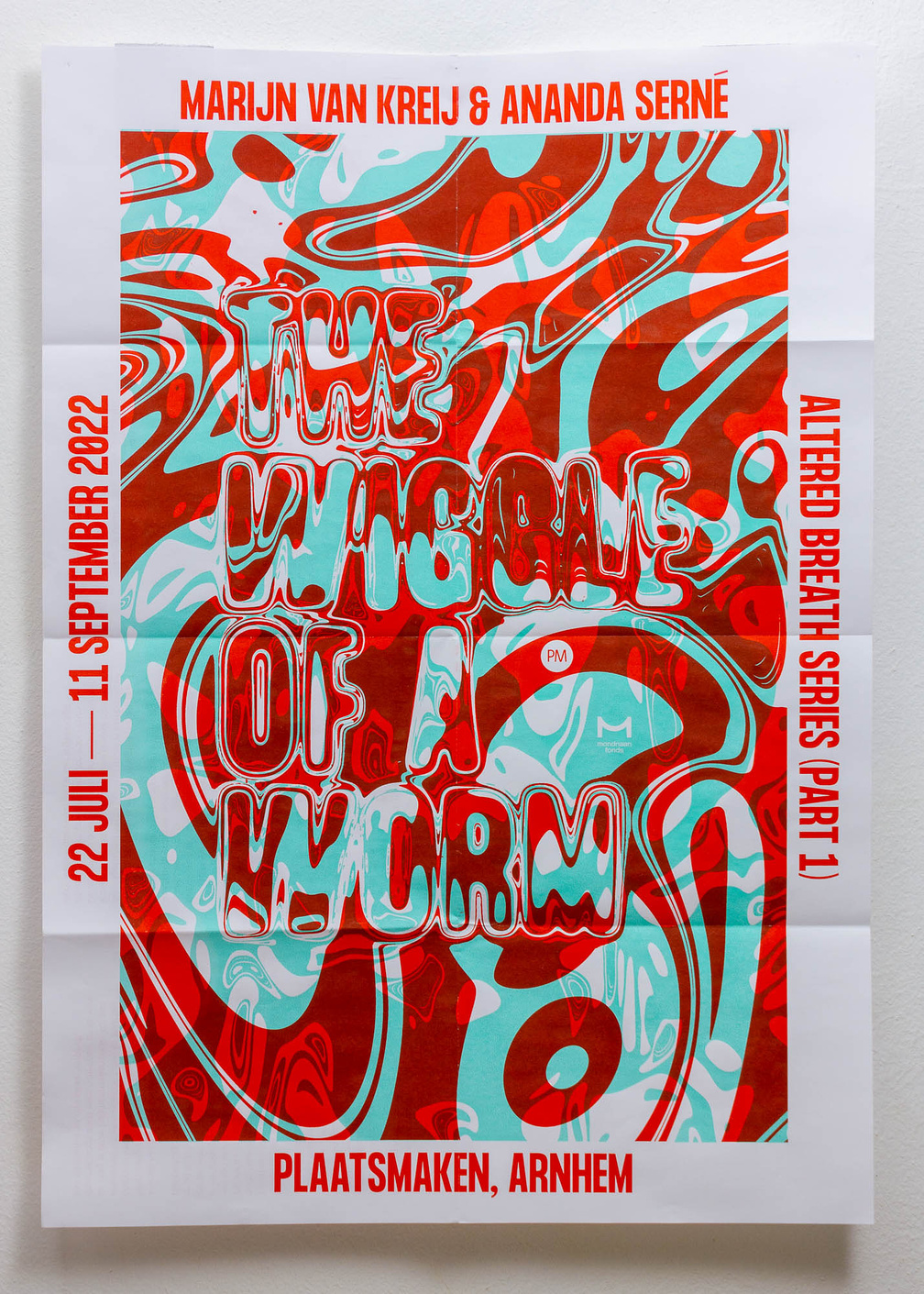
Altered Breath
June 2022 – Visual identity for "Altered Breath", an exhibition and lecture series at Plaatsmaken, Arnhem.
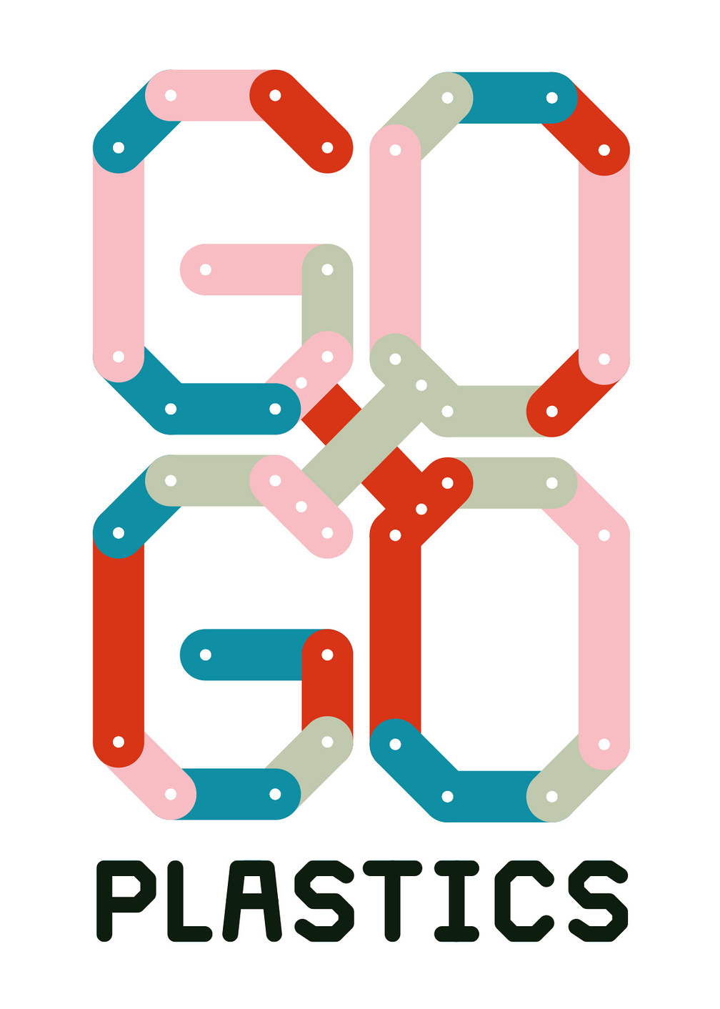
Gogo Plastics
March 2020 – Logotype and website for Gogo Plastics, Arnhem (NL). GoGo Plastics is an initiative of artist Kevin van Braak and produces panels and products from 100% recycled plastic. Plastics from various waste streams are pressed by hand and recycled into unique, durable and waterproof panels for versatile use.
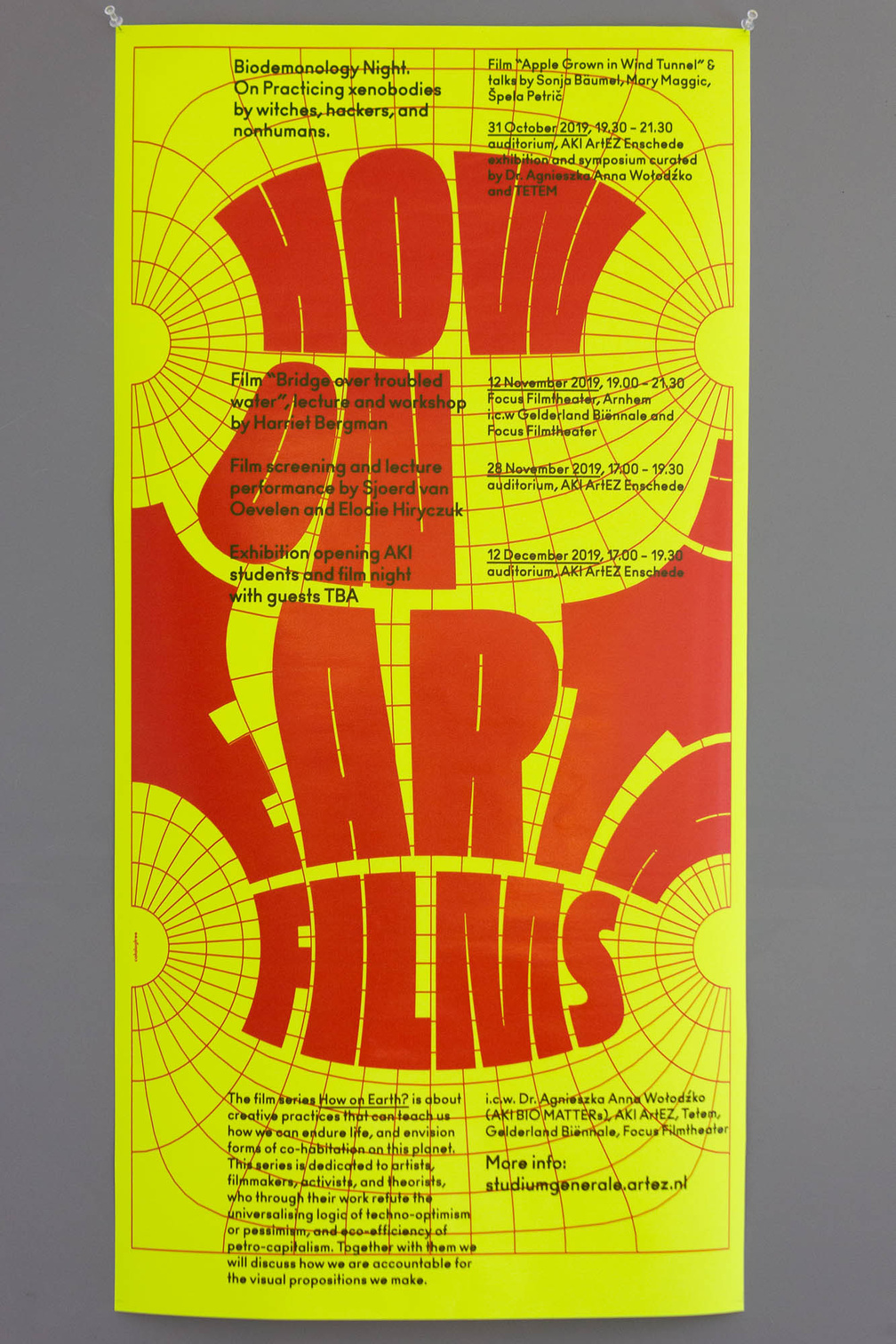
HOW ON EARTH?
November 2019 – Poster for the film series "How on Earth?" about creative practices that can teach us how we can endure life, and envision forms of co-habitation on this Earth.
APRIA
June 2019 – Animated logotype for Apria, a new platform for Research Interventions of the Arts.
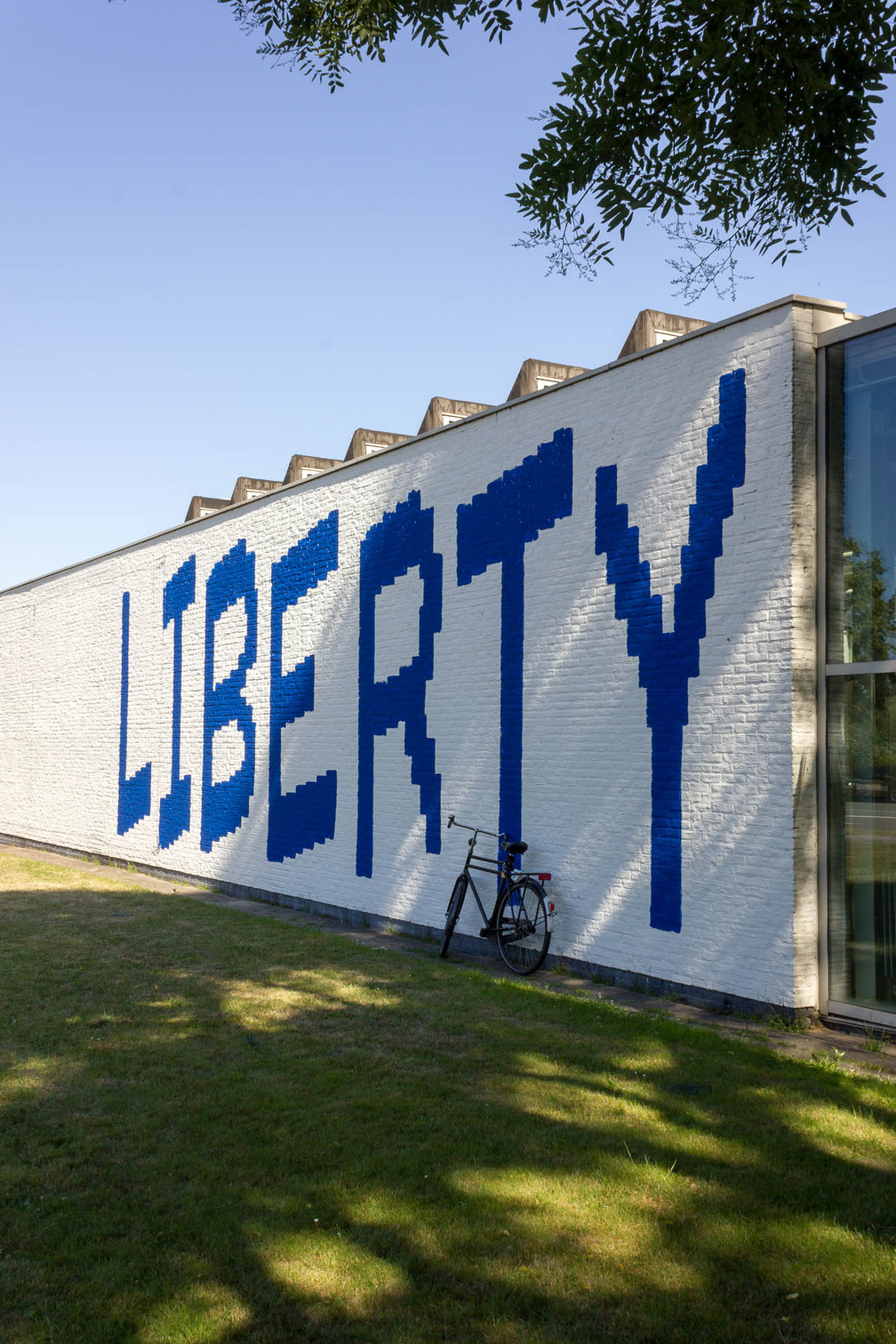
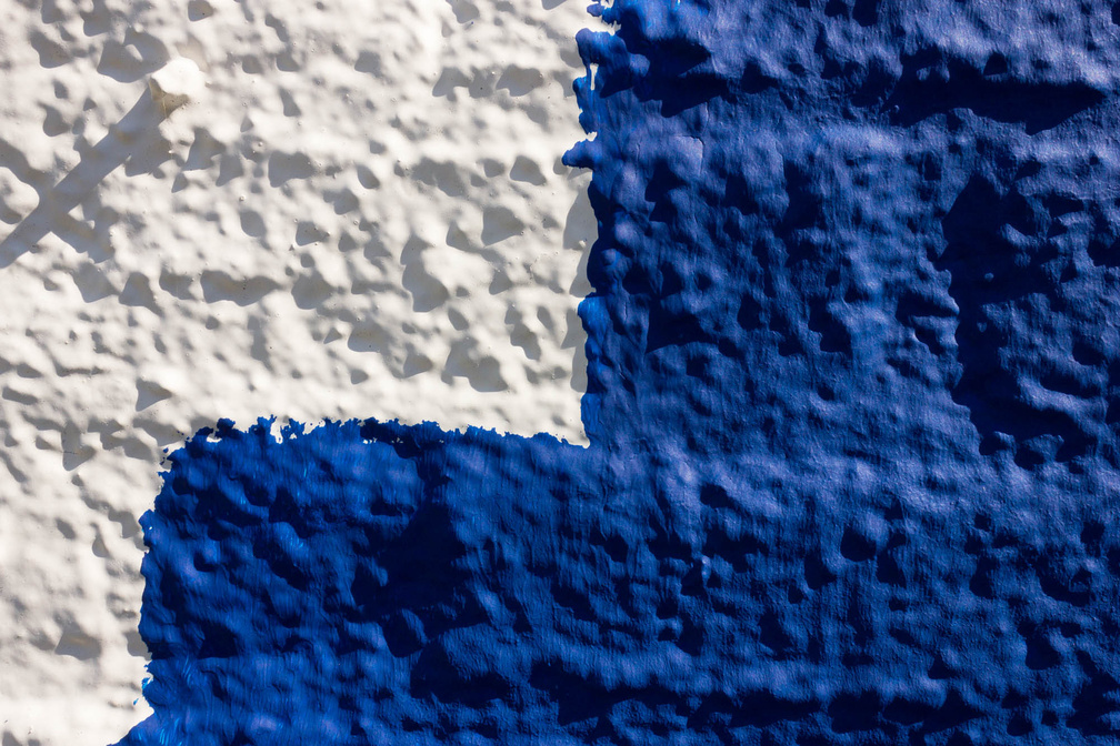
ArtEZ Finals 2018
July 2018 – Signage & Ephemera for the Art & Design Finals of the ArtEZ Institute of the Arts’ Class of 2018
October 2017 – Cover design for "Asemic Dialogues" by Jaap Blonk and Tomomi Adachi.
July 2017 – Customized glyphs as a dynamic logotype for modem, an architectural practice in Oakland (US) by Kathryn Moll and Nicholas de Monchaux.
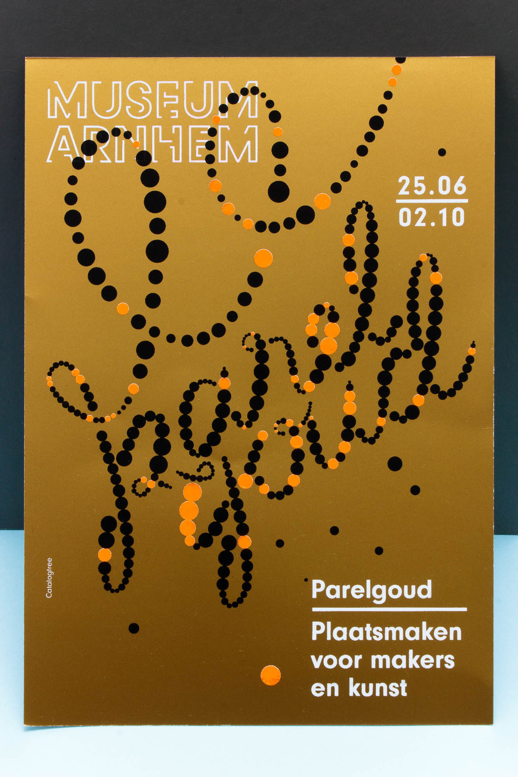
June 2016 – Logotype, identity and ephemera for the exhibition ‘Parelgoud’ on the occasion of 30 years of Plaatsmaken at the Museum Arnhem (NL).
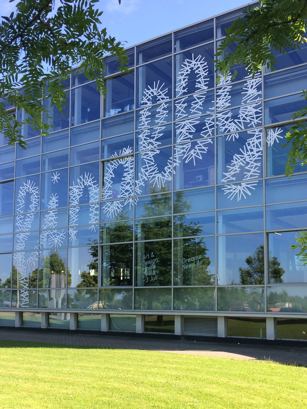
June 2016 – Façade lettering as part of the signage for the Art & Design Finals of the ArtEZ Institute of the Arts’ Class of 2016. The lettering is made of about 760 strokes of (hopefully) easy to remove Nichiban Gaffa Tape.
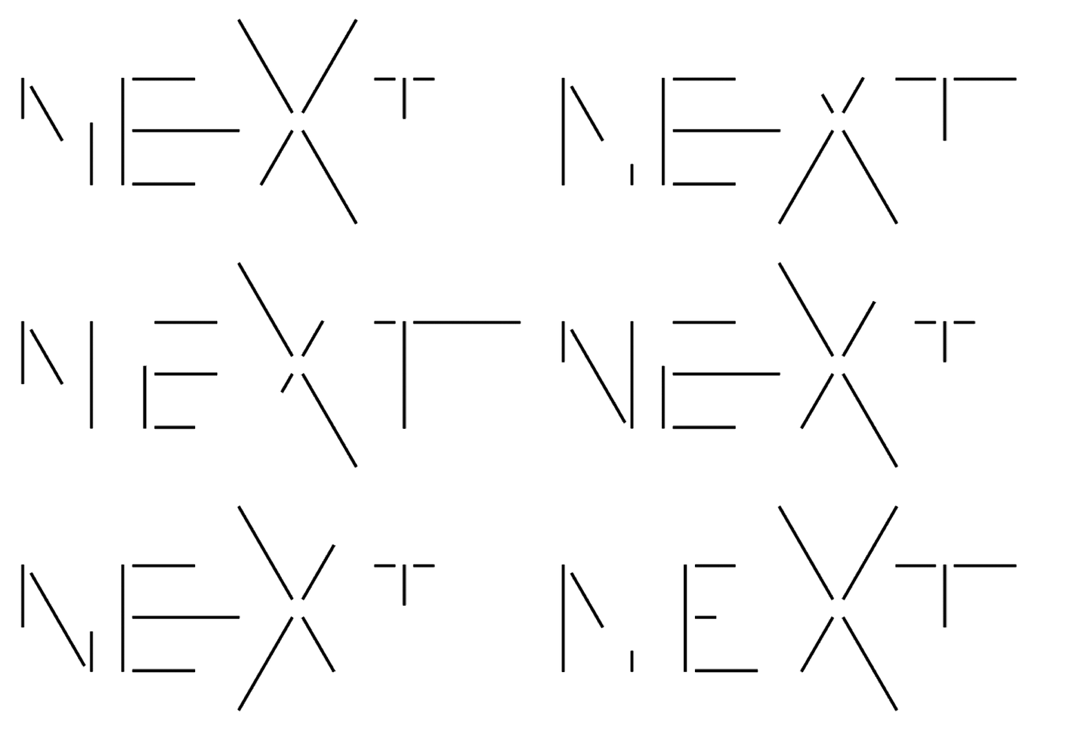
January 2015 – Identity for NEXT architects based in Amsterdam (NL).
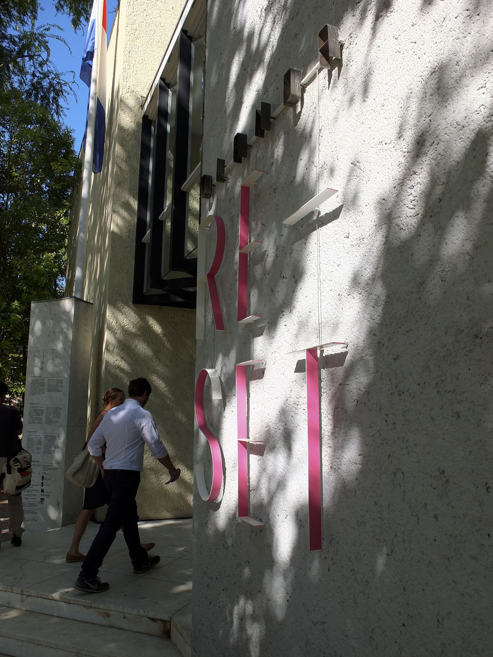
August 2012 – Façade lettering for the installation by inside outside / Petra Blaisse at the dutch pavilion at the Biennale Architettura 2012 in Venice (IT).
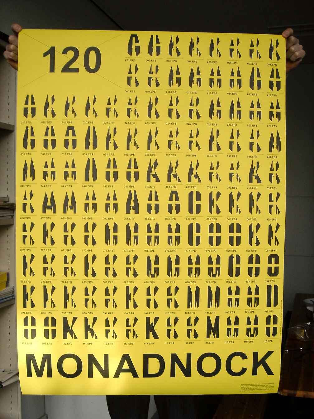
Monadnock poster
January 2008 – Poster showing all possible logotypes for Monadnock architects, Rotterdam (NL).
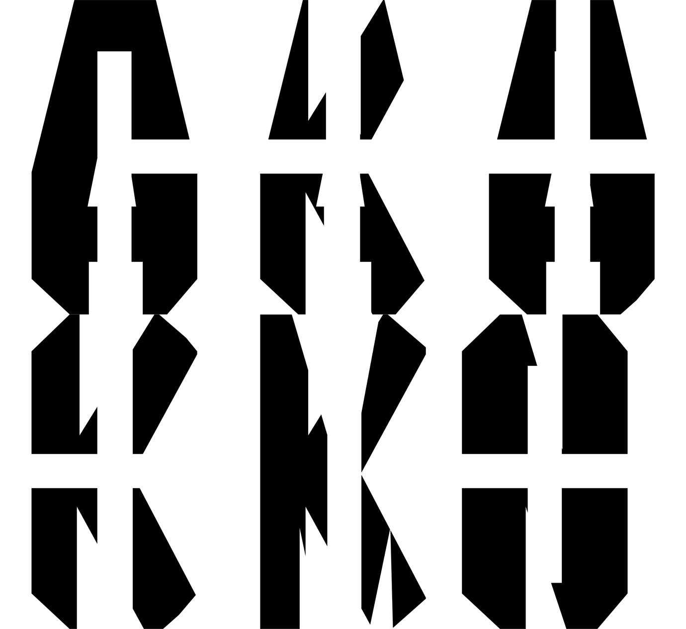
Monadnock logo
February 2007 – Logo for Rotterdam based architects Monadnock. With each save, export or print command, the logo is automatically generated from a postscript file, randomly using two or more of the characters M, O, N, A, D, C and K. In collaboration with Lutz Issler (programming) .
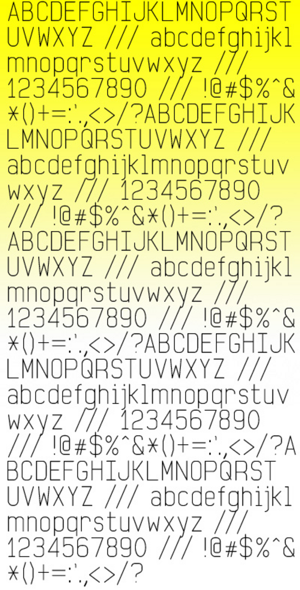
transurban font
June 2006 – Typeface design based on a standard plotter font. In collaboration with Thijs Gadiot .
